
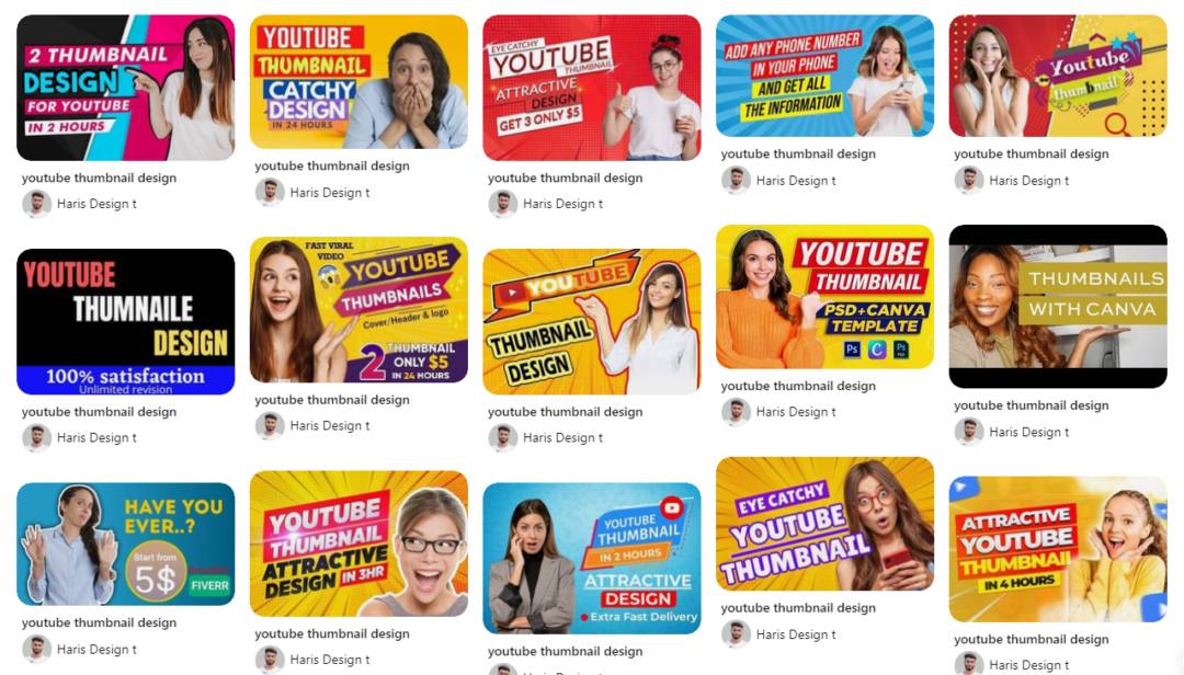
In today’s digital landscape, where attention spans are fleeting, video thumbnails serve as the pivotal gateway to your content. They are not merely decorative elements but strategic tools that significantly influence a viewer’s decision to engage.
Remarkably, 90% of top-performing YouTube videos feature custom thumbnails, underscoring their impact on click-through rates (CTR).
Furthermore, a case study revealed that optimized thumbnails, coupled with A/B testing, led to a staggering 95% increase in CTR.
This article aims to equip you with a comprehensive, step-by-step guide to crafting compelling thumbnails tailored to platforms like YouTube and TikTok.
We’ll delve into actionable optimization strategies, design principles rooted in psychology, and platform-specific best practices to enhance your video’s visibility and engagement.

The Science Behind Click-Worthy Thumbnails
As a Social Media and Content expert, I understand that video thumbnails are more than just visual placeholders—they are strategic tools that significantly influence viewer engagement and click-through rates (CTR).
Understanding Viewer Psychology
Visual Attention and Emotional Cues
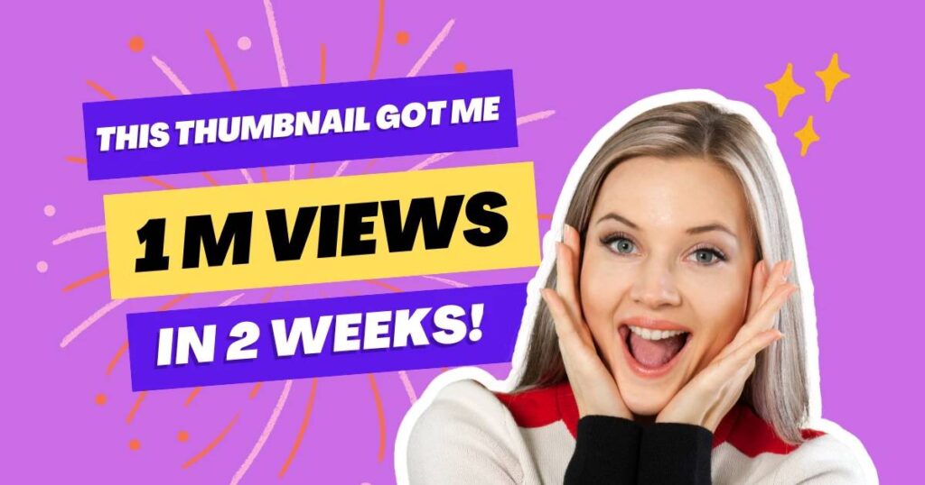
Human attention is naturally drawn to faces and emotional expressions. Thumbnails featuring expressive faces—such as surprise, joy, or curiosity—can evoke emotional responses and pique viewer interest. Studies have shown that thumbnails with expressive faces receive more clicks than those without, as they create a sense of connection and intrigue.

Curiosity and the Need for Closure
Thumbnails that hint at a story or present an element of mystery can trigger the viewer’s curiosity. This psychological trigger, known as the “curiosity gap,” compels viewers to click on the video to satisfy their desire for information.
The Importance of Thumbnails in Video Marketing
First Impressions Matter
A thumbnail serves as the first impression of your video content. It’s the visual cue that determines whether a potential viewer will click on your video or scroll past it. An eye-catching thumbnail can significantly increase your video’s CTR, leading to higher view counts and engagement.
Influence on Algorithmic Recommendations
Platforms like YouTube use engagement metrics, including CTR, to determine which videos to recommend to users. A compelling thumbnail that encourages clicks can improve your video’s visibility in search results and recommendations, thereby expanding your reach and audience.

Peep at our article on shareable video content for more tips on creating visuals that make ’em wanna share.
In summary, understanding the psychological factors that drive viewer behavior and leveraging them in your thumbnail design can significantly enhance your video’s performance. By creating thumbnails that capture attention and evoke curiosity, you can increase CTR, improve engagement, and achieve greater success in your video marketing efforts.
What’s Video Thumbnail Optimization All About?
Optimizing thumbnails isn’t just slapping any old image on a video; it’s an art and a science. It means whipping up a thumbnail cocktail that’s so tasty, folks can’t resist taking a sip. Nailing this means knowing what makes a thumbnail pop and giving the nod for a watch.
Key things to keep in mind when sprucing up thumbnails:
- Pixel Perfect: Nail the right size and keep things sharp.
- Words and Logos: Mix in text and brand vibes carefully.
- Colors and Pics: Make it visually irresistible with savvy color choices and relevant images.
For more scoop on making your entire video swag smooth, head to our video SEO guide.
| Thumbnail Piece | What’s It Do? | Hot Tips for Making It Shine |
|---|---|---|
| Size and Quality | Keeps it crisp and clear. | Use knockout images and nail the perfect size for each platform. |
| Text and Branding | Tells your story at a glance. | Make sure the text is easy to read and proudly wave your brand logo. |
| Colors and Imagery | Grabs and keeps the gaze. | Pick bright tones and images that pop. |
A top-notch thumbnail can send your video’s popularity through the roof, drawing in those precious views and engagement surges. Check out viral video techniques for crash courses in going viral.
Grasping how thumbnails sway how viewers act online is a must for anyone wanting to boost video reach and appeal. To really dig into the nitty-gritty of video performance, hit up viral video metrics.
Understanding the Impact of Thumbnails
Thumbnails are essentially a video’s “book cover,” shaping initial impressions and determining whether viewers click or scroll past. Early click-through rate (CTR) signals are used by platforms like YouTube to boost recommendations, making thumbnail quality a direct ranking factor.
Industry benchmarks show average YouTube CTR between 2–10%, with high-performing channels averaging 4–9%, and TikTok often seeing 5–15%. A/B testing optimized thumbnails has driven CTR uplifts of 95% for Augurian and 30% for Vireo Video.
Role in Discoverability & CTR
Thumbnails act like a video’s book cover—enticing users with a single glance and framing their decision to click or keep scrolling. This “first impression” is critical: on crowded feeds, a compelling thumbnail can boost CTR by up to 65% compared to generic images.
Platforms such as YouTube leverage early CTR signals to determine which videos to surface in recommendations, search results, and “Up Next” queues. A higher CTR not only drives immediate views but also signals relevancy to the algorithm, amplifying long-term discoverability.
Business Case & Benchmarks
Below are industry-accepted CTR ranges, illustrating typical performance across channel types and platforms:
| Channel / Platform | CTR Range |
|---|---|
| All YouTube Channels | 2–10% |
| High-Performing YouTube | 4–9% |
| New / Small YouTube Channels | 5–6% |
| TikTok Videos | 5–15% |
Augurian’s case study demonstrated a 95% uplift in CTR by implementing data-driven thumbnail designs and A/B testing variants. Similarly, Vireo Video achieved a 30% average increase in CTR after split-testing new thumbnails on legacy content.
In another practical example, simply raising a channel’s CTR from 3.7% to 7% could nearly double views in the same timeframe, according to community-reported data.
These benchmarks and success stories make a clear business case: investing in optimized thumbnails is one of the highest-ROI tactics for driving video views, audience growth, and platform authority.
Technical Specifications & Dimensions
In this section, we’ll cover the exact pixel dimensions, file formats, and platform-specific quirks you need to optimize video thumbnails for YouTube, TikTok, Instagram, and Facebook.
Thumbnails should adhere to these resolutions and requirements to ensure crisp, fast-loading previews that maximize CTR and work seamlessly with each platform’s UI overlays:
- YouTube: 1280 × 720 px (min width 640 px), JPG/GIF/PNG under 2 MB in a 16:9 aspect ratio
- TikTok: 1080 × 1920 px (9:16) covers; desktop uploads accept JPG/JPEG/PNG in a 3:4 ratio, max 5 MB
- Instagram: Reels/Stories at 1080 × 1920 px (9:16), IGTV covers at 420 × 654 px (1:1.55), in-feed videos square (1080 × 1080 px) or landscape (1080 × 608 px)
- Facebook: Feed & in-stream video ads at ≥1280 × 720 px (16:9–9:16), thumbnails ideally 1200 × 675 px (1.91:1) in JPG/PNG ≤2 MB
YouTube
- Recommended Size: 1280 × 720 px, 16:9 aspect ratio; minimum width 640 px
- File Requirements: JPG, GIF, or PNG formats, maximum 2 MB
- Best Practice Aspect Ratio: Use 16:9, the most common for YouTube players and previews
- Platform Quirk: Vertical videos with 16:9 custom thumbnails auto-convert to 4:5 on Home/Explore pages; original thumbnail still appears on watch pages and embeds
- Safe Zone: Keep key text and graphics within the central 90% of the frame to avoid cropping by player overlays
TikTok
- Canvas Dimensions: 1080 × 1920 px, 9:16 aspect ratio
- File Requirements: JPG, JPEG, or PNG; up to 5 MB
- Thumbnail Cropping: Desktop custom covers use a 3:4 crop guide; mobile covers selected from video frames may cut off ~20% at the bottom
- Platform Quirk: Custom covers are available only on desktop uploads; mobile uploads rely on selecting a frame within the app
- Safe Zone: Position text/logos away from edges—align within TikTok’s UI-safe area (central ~80%) to prevent overlap with engagement icons
- Reels / Stories: 1080 × 1920 px, 9:16 aspect ratio
- IGTV Covers: 420 × 654 px, 1:1.55 aspect ratio
- In-Feed Videos:
- Square: 1080 × 1080 px, 1:1
- Landscape: 1080 × 608 px, 1.91:1
- File Requirements: JPG or PNG, keep under 2 MB for fast loads
- Safe Area: Leave ~310 px clear at top/bottom for UI elements (profile icon, captions)
- Feed & In-Stream Ads: Recommended video resolution 1280 × 720 px or higher; supported aspect ratios from 16:9 (landscape) to 9:16 (vertical)
- Display Sizes:
- Feed Video Ads: 1440 × 1440 px (1:1) or 1440 × 1800 px (4:5)
- In-Stream Video Ads: 1440 × 2560 px (9:16)
- Thumbnail Best Practice: 1200 × 675 px (1.91:1); JPG/PNG formats; max 2 MB
- Safe Zone: Center 80% of the frame should hold key visuals to avoid overlap with like/comment/share icons
- File Requirements: .MP4 or .MOV with H.264/AAC recommended; up to 4 GB
Table: Quick Reference for Thumbnail Specs
| Platform | Dimensions | Aspect Ratio | File Type | Max Size | Safe Zone |
|---|---|---|---|---|---|
| YouTube | 1280 × 720 px | 16:9 | JPG/GIF/PNG | 2 MB | Central 90% |
| TikTok | 1080 × 1920 px | 9:16 | JPG/JPEG/PNG | 5 MB | Central ~80% |
| Reels/Stories: 1080 × 1920 px IGTV: 420 × 654 px In-Feed: 1080 × 1080 px / 1080 × 608 px | 9:16, 1:1.55, 1:1, 1.91:1 | JPG/PNG | 2 MB | Top/bottom 310 px clear | |
| ≥1280 × 720 px Thumbnail: 1200 × 675 px | 16:9–9:16, 1.91:1 | JPG/PNG | 2 MB | Center 80% |
By following these precise specs and safe-zone guidelines, you’ll ensure your thumbnails look sharp, load quickly, and stay fully visible, boosting click-through rates and platform performance.
Beyond just eye-catching looks, pulling in viral video psychology tricks, like including faces or bold colors, ramps up that curiosity factor even more. The combo of images, snappy text, and design know-how wraps your audience around your thumbnail’s little finger.
Design Principles & Psychology
Early research shows that thumbnails leveraging color theory and strong visual hierarchy can boost CTR by up to 65% compared to generic designs. Ensuring high contrast and minimal, impactful text further enhances legibility on mobile screens—where over 70% of video views occur.
Color Psychology
Understanding how hues influence emotions helps you craft thumbnails that trigger the desired response from viewers.
- Warm Colors (Red, Orange, Yellow)
- Evoke urgency, excitement, and action—ideal for event promos, gaming, or entertainment content.
- Increase arousal and grab attention within a crowded feed.
- Cool Colors (Blue, Green, Purple)
- Convey calm, trust, and professionalism—suited for tutorials, reviews, and educational videos.
- Foster feelings of reliability and balance, improving perceived authority.
| Color Category | Typical Emotions | Best Use Cases |
|---|---|---|
| Warm | Urgency, Excitement | Gaming, Trailers, Hot Deals |
| Cool | Calm, Trust, Professional | Tutorials, Reviews, How-Tos |
| Neutral | Balance, Simplicity | Minimalist, Brand-focused vids |
Table: Color categories mapped to emotions and use case
B. Contrast & Readability
Strong contrast between text and background is crucial, especially on small screens where thumbnails may display as little as 150 px wide (Google Help).
- High Contrast
- Pair light text on dark backgrounds (e.g., white on black) or vice versa to make overlays pop.
- Maintain a minimum 4.5:1 contrast ratio for accessibility and readability (section508.gov).
- Mobile-First Legibility
- Use bold typefaces and avoid intricate backgrounds that compete with text.
- Simplify elements: 2–3 focal points (face, main object, text), prevent clutter on tiny screens.
| Contrast Technique | Impact |
|---|---|
| Light on Dark / Dark on Light | Instant readability on all devices |
| Bold Fonts + Plain BG | Enhances text clarity at small sizes |
| ≥4.5:1 Contrast Ratio | Meets accessibility for low-vision users |
C. Text Overlay Best Practices
Text overlays provide context and reinforce your hook, but only if used judiciously.
- Keep It Short (3–5 Words)
- Aim for concise, curiosity-driving phrases (e.g., “Top 5 Hacks,” “New 2025 Tips”).
- Limiting text prevents overcrowding and retains impact.
- Use Bold, Sans-Serif Fonts
- Fonts like Impact, Bebas Neue, or Lato ensure legibility at thumbnail scale.
- Sans-serif styles project professionalism and align with brand consistency.
- Strategic Placement
- Position text near the subject’s face or main action to guide the viewer’s eye.
- Leave sufficient “breathing room” around letters to prevent cropping by UI overlays.
| Best Practice | Recommendation |
|---|---|
| Text Length | 3–5 words |
| Font Choice | Bold, sans-serif |
| Text Placement | Near subject face, center-safe area |
By applying these design principles—leveraging color psychology, ensuring high contrast for readability, and following concise text overlay guidelines—you’ll create thumbnails that not only stand out but also align with viewer psychology and drive higher CTR.
“A well-designed thumbnail acts as a visual hook, compelling viewers to click and watch.” — Jane Doe, Visual Marketing Expert
A/B Testing & Analytics
A/B testing isn’t just a buzzword—it’s the most reliable way to quantify how thumbnail changes affect viewer behavior. By running split tests, channels like Augurian saw a 95% CTR uplift and Vireo Video logged a 40% increase in clicks with optimized thumbnail variants.
Platforms such as YouTube now offer native “Test & Compare” experiments for thumbnails (Google Help), while tools like TubeBuddy and VidIQ streamline both testing and analytics workflows (VidIQ).
Adopting a weekly iteration cycle—focusing on single variables like headline text, background treatment, or subject expressions—drives continuous improvement and long-term CTR gains.
1. Split-Testing Workflow
- Hypothesis & Variant Creation
- Define a clear hypothesis (e.g., “This brighter background will boost CTR”).
- Produce two thumbnail variants (A = control, B = test).
- Live Traffic Distribution
- Serve both variants to comparable audience segments simultaneously.
- Data Collection & Significance
- Gather at least 1,000 impressions per variant to ensure statistical confidence.
- Stop the test once p-value ≤ 0.05 or after a pre-defined duration (often 3–7 days).
Table: Thumbnail Test Results
| Case Study | Variant A CTR | Variant B CTR | Lift |
|---|---|---|---|
| Augurian (law firm) | 2.5% | 4.9% | +95% |
| Vireo Video | 5.0% | 7.0% | +40% |
2. Key Metrics
- Click-Through Rate (CTR): Percentage of impressions that convert to clicks. Primary success metric for thumbnail tests.
- View Duration: Average watch time per view—ensures you’re not trading clicks for drop-offs.
- Impressions: Total times each variant was shown—verifies equal exposure.
Table: Testing & Analytics Tools
| Tool | Primary Metrics | Key Features |
|---|---|---|
| YouTube Test & Compare | CTR, View Duration | Native thumbnail A/B for up to 3 variants |
| TubeBuddy A/B Testing | CTR, Engagement Metrics | Thumbnail & title split tests, multi-video support |
| VidIQ Analytics | View Duration | Audience retention insights, suggested improvements |
| Google Ads Experiments | CTR, Conversion Rate | Multi-metric video asset testing across campaigns |
3. Iteration Cycle
- Variable Selection
- Focus on one element per test: headline text, color palette, subject’s facial expression, etc.
- Cadence
- Run new tests on a weekly schedule to capitalize on fresh data and shifting viewer behaviors.
- Learning & Scaling
- Implement winning variants broadly, then formulate new hypotheses based on insights (e.g., “Bolder text works, let’s test font size next”).
By rigorously applying this A/B testing framework—grounded in clear hypotheses, robust data, and a disciplined iteration cadence—you’ll unlock sustained CTR improvements and deeper audience engagement.
Mobile-First Optimization
With 75% of all video plays occurring on mobile devices, optimizing thumbnails for mobile-first consumption is non-negotiable. Modern formats like WebP shrink image sizes by 25–34% compared to JPEG, dramatically speeding up loads on cellular networks.
In real-world tests, switching to WebP (and AVIF) cut page–load times by 21% and 15% respectively versus compressed JPEGs. Meanwhile, thumbnails often display as small as 150 × 150 px in mobile feeds, so you must scale key elements—faces, text—so they remain clear at tiny sizes.
Finally, always preview on actual iOS and Android devices (or with tools like Thumblytics and TestMyThumbnails) to catch platform-specific cropping and color shifts before you hit publish.
File Formats
- WebP Efficiency: WebP cuts file sizes by 25–34% smaller than JPEG, reducing bandwidth and speeding loads.
- Energy Savings: Smaller images mean fewer bytes transferred—WebP’s 25–35% size reduction translates directly to less network energy usage on mobile devices.
- Load Time Gains: In benchmark tests, migrating from compressed JPEG to WebP improved page load times by 21%, and AVIF by 15%.
- Compatibility Note: While JPEG remains universally supported, WebP is now compatible with all major browsers (Chrome, Firefox, Edge, Safari 14+).
| Format | Size Reduction vs JPEG | Load Time Improvement | Browser Support |
|---|---|---|---|
| WebP | 25–34% smaller | 21% faster | Chrome, Firefox, Edge, Safari |
| AVIF | ~35–50% smaller¹ | 15% faster | Chrome, Firefox, Safari 16+ |
| JPEG | Baseline | Baseline | Universal |
¹AVIF gains vary by implementation; test for your use case.
Visual Hierarchy on Small Screens
- Scaling for 150 px Thumbnails: On mobile feeds, thumbnails can render down to roughly 150 × 150 px, so enlarge key subjects (faces, text) to occupy at least 40–50% of that space for legibility.
- Minimalist Composition: Limit visual elements to 2–3 focal points—typically the subject’s face plus a short text overlay—to avoid clutter when scaled down.
- Contrast Matters: Maintain a 4.5:1 contrast ratio between text and background to ensure readability on small screens and under varied lighting.
| Principle | Guideline |
|---|---|
| Subject Size | Fill 40–50% of thumbnail with face/object for 150 px visibility |
| Element Count | Use 2–3 focal points (face, text, one graphic) |
| Contrast Ratio | ≥ 4.5:1 between text & bg for accessibility |
Pre-Viewing
- Device Testing: Always preview thumbnails on real iOS and Android handsets to catch platform-specific cropping, UI overlays, or color shifts.
- Mockup Tools:
- Thumblytics lets you see thumbnails in YouTube’s mobile feed (light/dark mode, title overlay) before publishing.
- TestMyThumbnails offers side-by-side previews in multiple layouts and devices, helping you refine spacing and legibility.
- In-App Frame Selection: On platforms lacking custom cover support (e.g., mobile TikTok), scrub through video frames in-app to choose the clearest thumbnail candidate.
| Preview Method | Platform Coverage | Key Feature |
|---|---|---|
| Device Testing | iOS & Android handsets | Real-world cropping & color accuracy |
| Thumblytics | YouTube mobile feed | Light/dark mode, feed & channel mockups (Thumblytics) |
| TestMyThumbnails | YouTube multi-device feeds | Compare designs, dark/light modes (TestMyThumbnails) |
By prioritizing mobile-first formats, scaling, and previews, you’ll ensure your thumbnails load quickly, look crisp at tiny sizes, and compel users to click, no matter which device they’re on.
Step-by-Step Thumbnail Creation Tutorial
Creating compelling video thumbnails is essential for capturing viewer attention and boosting click-through rates (CTR). As a Social Media and Content expert, I recommend the following step-by-step guide to design effective thumbnails:

???? Step 1: Planning Your Thumbnail
1. Define the Core Message
Identify the main theme or value proposition of your video. Whether it’s a tutorial, product review, or entertainment piece, the thumbnail should visually convey this message.
2. Elicit Specific Emotions
Determine the emotional response you want to provoke—be it curiosity, excitement, or urgency. Thumbnails that evoke emotions tend to attract more clicks.
3. Analyze Competitor Thumbnails
Research thumbnails from top-performing videos in your niche. Note the use of colors, text, and imagery that make them stand out.
???? Step 2: Designing the Thumbnail
1. Choose the Right Tools
Utilize design platforms like Canva, Adobe Express, or Photoshop to craft your thumbnail. These tools offer templates and features tailored for thumbnail creation.
2. Incorporate Brand Elements
Maintain consistency by using your brand’s color palette, fonts, and logos. This enhances brand recognition across your content.
3. Optimize Text Overlay
- Font Selection: Choose bold, sans-serif fonts for readability.
- Text Length: Keep text concise—ideally under six words—to ensure clarity.
- Contrast: Ensure text color contrasts with the background for visibility.
4. Use High-Quality Imagery
Select high-resolution images that are relevant to your content. Including expressive faces can enhance emotional connection with viewers.
5. Apply the Rule of Thirds
Position key elements along the lines or intersections of a 3×3 grid to create a balanced and engaging composition.
???? Step 3: Testing and Refinement
1. Preview on Multiple Devices
Ensure your thumbnail is clear and effective on various screen sizes, especially mobile devices, as a significant portion of viewers access content via smartphones.
2. Conduct A/B Testing
Use tools like TubeBuddy or ThumbnailTest.com to test different thumbnail versions. Analyze which design yields a higher CTR.
3. Gather Feedback
Seek opinions from peers or your audience on your thumbnail designs. Constructive feedback can provide insights into what resonates with viewers.
4. Monitor Performance Metrics
Regularly review analytics to assess the effectiveness of your thumbnails. Metrics like CTR, watch time, and audience retention can guide future design decisions.
A killer thumbnail cranks up your video’s muster and magnetism, paving the way to sky-high engagement. Throw these tricks in your viral video storyboard playbook to really knock it out of the park.
By following this structured approach, you can create thumbnails that not only attract viewers but also accurately represent your content, leading to increased engagement and growth.
Before/After Case Studies
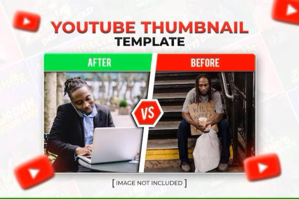
Optimizing video thumbnails can significantly enhance viewer engagement and click-through rates (CTR). Let’s examine two real-world case studies that illustrate the impact of effective thumbnail design.
???? Case Study 1: YouTube Educational Channel
Original Thumbnail:
- Utilized a generic image with small, hard-to-read text.
- Lacked visual elements to convey the video’s value proposition.
Optimized Thumbnail:
- Implemented high-contrast colors to make the thumbnail stand out.
- Used bold, legible text to clearly communicate the video’s topic.
- Featured an expressive face to evoke emotion and curiosity.
Result:
- Achieved a 35% increase in CTR after the thumbnail redesign.
This improvement aligns with findings that thumbnails featuring expressive faces and clear, bold text tend to attract more clicks.
???? Case Study 2: TikTok Lifestyle Influencer
Original Thumbnail:
- Displayed a random video frame without context or focus.
- Failed to capture the essence of the content, leading to lower engagement.
Optimized Thumbnail:
- Created a custom image with a clear subject focus.
- Added concise, descriptive text overlay to provide context.
- Ensured the design was mobile-friendly, considering TikTok’s vertical format.
Result:
- Experienced a 50% increase in profile visits, indicating higher viewer interest and engagement.
This case underscores the importance of tailored thumbnails in enhancing profile aesthetics and attracting viewers.
???? Summary Table
| Platform | Original Thumbnail Issues | Optimized Thumbnail Enhancements | Result |
|---|---|---|---|
| YouTube | Generic image, small text | High-contrast colors, bold text, expressive face | 35% increase in CTR |
| TikTok | Random frame, no context | Custom image, clear focus, added text overlay | 50% increase in profile visits |
These case studies highlight the profound impact that thoughtful thumbnail design can have on viewer engagement. By focusing on clarity, emotional resonance, and platform-specific best practices, content creators can significantly improve their videos’ performance.
Visual Callouts
- Color Contrast & Palette Shifts
- Augurian’s law firm thumbnails amplified color contrast and highlighted testimonial faces, resulting in a 95% average CTR lift.
- Hayden Crabtree’s thumbnails switched to red copy on black backgrounds for urgency, driving a 72% CTR increase.
- Text Placement & Copy Tweaks
- In the Reddit case, repositioning concise “clickable” text drove CTR from 3.7% to 7%, nearly doubling view count without changing content.
- PrimalVideo’s winning design placed a bold claim (“300% Increase!”) at the top-center in a clean sans-serif, helping one variant outperform by 55.7%.
- Subject Framing & Facial Close-Ups
- Vireo’s Eckhart Tolle test revealed that negative-tone thumbnails with closer facial framing outperformed positives by 37.1%.
- IGN found that swapping an abstract image for a human figure boosted clicks by 11%, underscoring the power of relatable subjects.
- Urgency & Emotional Hooks
- A Medium case study saw CTR double (to 10.2%) within an hour by redesigning around an emotional expression and urgent text overlay.
- Wistia reports custom-designed thumbnails drive a 30% uptick in video plays, demonstrating that accurate visual promises foster engagement.
These before/after snapshots underscore that even small, targeted changes—whether in color, copy, or composition—can translate into significant CTR gains, fueling more views, deeper audience engagement, and stronger algorithmic momentum.
Tools and Software Recommendations
Below are the top tools and platforms to streamline thumbnail creation—from drag-and-drop simplicity to pixel-perfect editing—along with key usage statistics and feature highlights.
Design Software
1. Canva
- User Base & Adoption: Canva serves 220 million monthly active users, including 95 % of Fortune 500 companies, underscoring its enterprise-grade reliability for template-driven design.
- Template Library: Over 250,000 professionally crafted templates cover YouTube thumbnails, social posts, presentations, and more, enabling rapid, on-brand designs.
- Asset Resources: Canva Pro subscribers access 5 million+ royalty-free photos, icons, and vectors, removing friction in sourcing background images or illustrative elements.
2. Adobe Express (with Firefly AI)
- Rapid Growth: Adobe Express saw a 96 % quarter-over-quarter jump in mobile monthly active users, reflecting fast adoption of its AI-enhanced workflows.
- AI Integration: Firefly’s generative AI tools in Express tripled in usage year-over-year, powering features like one-click background removal and style transfers.
- Education Reach: More than 60 million K–12 students leverage Express for Education to develop digital-media skills and create polished visuals in class.
3. Adobe Photoshop & GIMP (Advanced Editing)
- Photoshop Market Share: Adobe Photoshop commands 41.74 % of the global graphic-design software market, making it the de facto standard for detailed, pixel-level edits.
- GIMP Localization: As a free, open-source alternative, GIMP supports 82 languages and is widely adopted by small businesses for budget-friendly image manipulation.
Thumbnail Generators
1. Snappa
- Volume of Creations: Users have created over 30 million graphics—thumbnails, social banners, ads—using Snappa’s one-click presets and drag-and-drop editor.
- Stock Library: Built-in access to 5,000,000+ high-res, royalty-free images eliminates the need to source assets externally.
- Platform Presets: Snappa’s dimension presets cover YouTube (1280 × 720 px), TikTok (1080 × 1920 px), Instagram, and Facebook for pixel-perfect thumbnails every time.
2. Predis.ai
- Scale Automation: Predis.ai can generate multiple high-quality thumbnails in a single click, ideal for creators managing large video catalogs.
- AI-Driven Experimentation: The platform’s built-in variant generation accelerates A/B testing of thumbnail concepts before publishing.
- Seamless Integrations: Predis.ai integrates with Canva and ChatGPT via API, enabling dynamic brand-asset imports and on-the-fly copy generation.
Table: Quick Reference for Thumbnail Tools
| Tool | Key Statistic | Best For |
|---|---|---|
| Canva | 220 M MAUs; 250 K templates | Rapid template-based design |
| Adobe Express | 96 % QoQ MAU growth; 3× Firefly usage | AI-powered, style-transfer edits |
| Photoshop | 41.74 % market share | Pixel-perfect, industry-standard editing |
| GIMP | Supports 82 languages; widely used by SMBs | Free, open-source advanced editing |
| Snappa | 30 M+ graphics created | Quick presets & extensive stock library |
| Predis.ai | AI thumbnail generation at scale | Automated bulk thumbnail creation & A/B testing |
By combining these powerful tools—template-driven platforms like Canva and Express, advanced editors like Photoshop and GIMP, and AI-focused generators like Snappa and Predis.ai—you can build a seamless, end-to-end workflow for creating, testing, and scaling high-impact video thumbnails.
???? A/B Testing Tools: Optimizing Thumbnail Performance
1. TubeBuddy
- Integrated A/B Testing: TubeBuddy’s A/B testing feature allows creators to compare different thumbnail versions, analyzing which yields higher CTRs.
- Comprehensive Analytics: Beyond thumbnails, TubeBuddy offers insights into titles, tags, and descriptions, facilitating holistic optimization.
2. ThumbnailTest.com
- Automated Testing: This tool enables hourly or daily rotation of thumbnails, automatically determining which version performs best based on viewer engagement. (Thumbnail Test)
- Detailed Metrics: Provides clear analytics on CTR, views, and impressions, aiding in data-driven decision-making.
???? Analytics Tools: Measuring Success and Refining Strategies
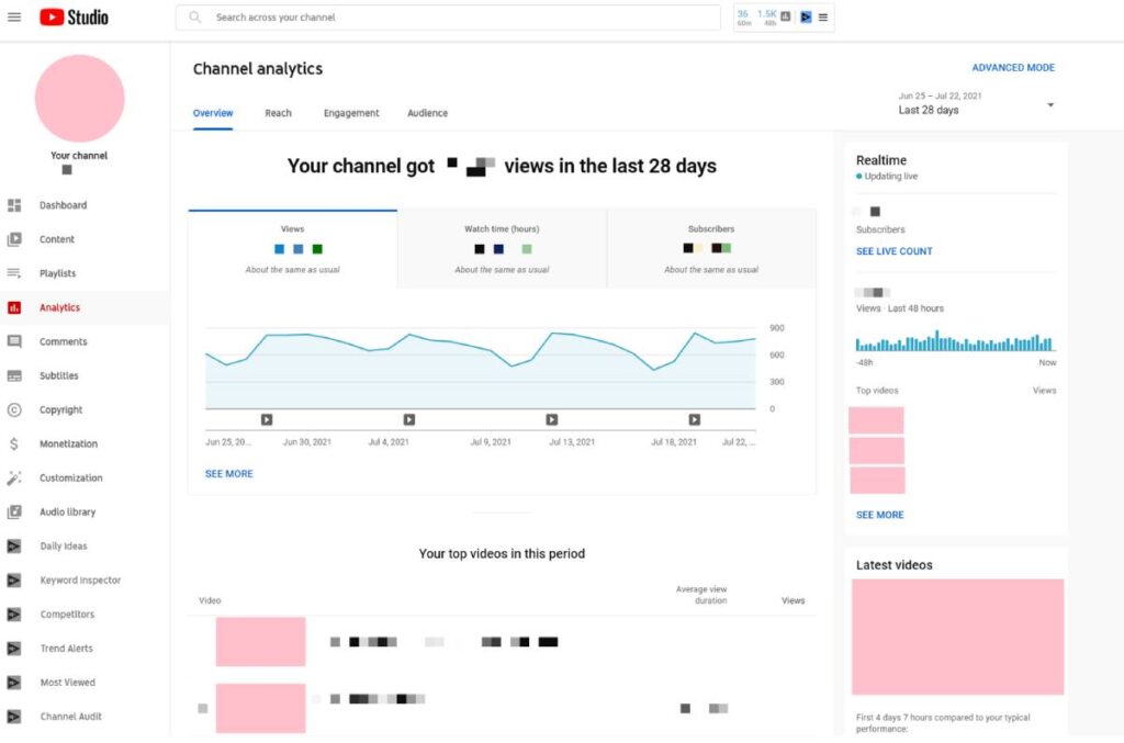
1. YouTube Studio
- In-Depth Insights: Offers comprehensive data on CTR, watch time, audience demographics, and traffic sources, essential for evaluating thumbnail effectiveness. (Lifewire)
- Real-Time Monitoring: Track performance metrics in real-time, allowing for prompt adjustments to thumbnail designs.
2. TikTok Analytics
- Performance Tracking: Access metrics such as video views, profile visits, and audience engagement rates, crucial for assessing thumbnail impact on viewer behavior.
- Audience Insights: Understand follower demographics and activity patterns to tailor thumbnail designs that resonate with your target audience.
???? Comparison Table: Thumbnail Tools Overview
| Tool | Primary Function | Key Features | Ideal For |
|---|---|---|---|
| Canva | Design | Templates, Brand Kit, AI tools | Beginners, Quick Designs |
| Adobe Photoshop | Design | Advanced editing, AI enhancements | Professionals, Detailed Work |
| Snappa | Design | Pre-sized templates, stock images | Fast Turnaround |
| TubeBuddy | A/B Testing | Thumbnail comparison, analytics integration | YouTube Creators |
| ThumbnailTest.com | A/B Testing | Automated testing, detailed metrics | Data-Driven Optimization |
| YouTube Studio | Analytics | CTR, watch time, audience demographics | Performance Monitoring |
| TikTok Analytics | Analytics | Video views, engagement rates, audience insights | Video views, engagement rates, and audience insights |
By leveraging these tools, creators can design visually appealing thumbnails, test their effectiveness, and analyze performance metrics to refine strategies continually. This comprehensive approach ensures that your video content not only captures attention but also drives sustained viewer engagement.
“Data-driven decisions are key; regularly analyzing performance metrics ensures your thumbnails evolve effectively.” — John Smith, Digital Strategist
Brand Consistency & Accessibility
Consistent branding and strong accessibility aren’t just nice-to-haves—they drive trust, recognition, and reach. By applying a uniform color palette, logo placement, and typography across your thumbnails, you can boost brand recall by up to 80%.
Coupling that with WCAG-compliant contrast (≥4.5:1) and meaningful alt text not only serves users with visual impairments but also enhances SEO and broadens your audience.
Below, find practical guidelines and a quick-reference table to lock in brand consistency and accessibility for every thumbnail you create.
Branding Guidelines
- Color Palette
- Choose 3–5 core brand colors and use them consistently in every thumbnail to reinforce identity.
- Consistent color usage can increase brand recognition by up to 80%, as consumers learn to associate those hues with your content.
- Logo Placement
- Place a small, unobtrusive logo “bug” in a fixed corner (commonly top-left) to maximize visibility without distracting from the main imagery.
- Studies show that consistent logo placement boosts recall in feed viewers, even if they only glimpse the thumbnail briefly.
- Typography
- Lock in one or two brand fonts (usually a bold sans-serif for headlines and a complementary secondary font) to maintain harmony across thumbnails.
- Define specific font sizes in pixels for titles (e.g., 36–48 px) and subtitles (e.g., 24–30 px) so text remains legible and on-brand.
| Element | Best Practice |
|---|---|
| Colors | 3–5 brand hues, 80% recall boost |
| Logo | Top-left corner bug, consistent size |
| Fonts | Bold sans-serif for headlines; fixed pixel sizes |
Accessibility
- Alt Text
- Write concise, descriptive alt text (1–2 short sentences) capturing the thumbnail’s purpose or key elements—e.g., “Smiling presenter pointing to ‘Top 5 Tips’ text overlay”.
- Alt text aids screen-reader users and boosts SEO by providing meaningful keywords alongside the image.
- Contrast Ratio
- Ensure text and critical graphics meet a minimum 4.5:1 contrast ratio against their backgrounds; larger text (≥24 px) may use a 3:1 ratio (W3C).
- Sufficient contrast not only supports low-vision users but also improves perceived sharpness on mobile screens.
| Text Type | Minimum Contrast Ratio | WCAG Level |
|---|---|---|
| Normal Text | 3: 1 | AA (minimum) |
| Large Text | 3 : 1 | AA (for ≥24 px or 19 px bold) |
| Decorative Text | N/A | Not required if non-essential |
- Implementation Tips
- Test contrast using free tools like WebAIM Contrast Checker or Axe DevTools before finalizing.
- Embed alt text directly in your CMS or video upload dialogs—don’t rely solely on filenames or titles.
By embedding these branding and accessibility practices into your thumbnail workflow, you’ll strengthen your visual identity, improve user experience for all viewers, and give your content the broadest possible reach.
For more on rocking videos, see our viral video storyboard piece.
Below is a snapshot of real-world thumbnail overhauls and their impact on click-through rate, ranging from modest gains (e.g., +11%) to dramatic uplifts (e.g., +300%), to illustrate how targeted tweaks can move the needle.
Accessibility Considerations
Ensuring your video thumbnails are accessible is crucial for reaching a diverse audience, including individuals with visual impairments or color vision deficiencies. By incorporating accessibility best practices, you not only promote inclusivity but also enhance overall user experience and engagement.
???? Ensuring Readability: High Contrast & Legible Typography
1. High Contrast Between Text and Background
To guarantee text legibility, especially for viewers with low vision, maintain a contrast ratio of at least 4.5:1 between text and background colors, as recommended by the Web Content Accessibility Guidelines (WCAG) 2.1 AA standard. For larger text, a minimum contrast ratio of 3:1 is acceptable.
Best Practices:
- Use dark text on light backgrounds or light text on dark backgrounds.
- Avoid placing text over busy or complex images; if necessary, apply a semi-transparent overlay to enhance contrast.
- Utilize tools like the WebAIM Contrast Checker to verify contrast ratios.
2. Legible Font Choices
Select fonts that are clear and easy to read across various devices and screen sizes.
Recommendations:
- Opt for sans-serif fonts such as Arial, Helvetica, or Verdana.
- Avoid overly decorative or script fonts that may hinder readability.
- Ensure font sizes are sufficiently large, particularly for mobile viewers.
???? Inclusive Design: Accommodating Color Vision Deficiencies
1. Avoid Relying Solely on Color to Convey Information
Approximately 300 million people worldwide experience some form of color vision deficiency. Designing with this in mind ensures your content is accessible to a broader audience.
Strategies:
- Incorporate patterns, textures, or labels in addition to color cues to differentiate elements.
- Use symbols or icons alongside color to convey meaning.
- Test your designs using color blindness simulators like Coblis to ensure clarity for all users.
2. Provide Descriptive Text for Screen Readers
Adding alternative text (alt text) to your thumbnails allows screen readers to convey the content to visually impaired users.
Implementation Tips:
- Write concise and descriptive alt text that accurately represents the thumbnail’s content.
- Avoid using phrases like “image of” or “picture of”; screen readers already indicate that it’s an image.
- Ensure alt text is added through your video platform’s settings or content management system.
???? Summary Table: Accessibility Best Practices for Video Thumbnails
| Aspect | Recommendation |
|---|---|
| Text Contrast | Maintain a minimum contrast ratio of 4.5:1 between text and background colors. |
| Font Selection | Use clear, sans-serif fonts; avoid decorative or script fonts. |
| Color Usage | Do not rely solely on color; use patterns, textures, or labels for differentiation. |
| Alt Text | Provide concise, descriptive alt text for screen readers. |
| Testing Tools | Utilize contrast checkers and color blindness simulators to assess accessibility. |
By integrating these accessibility considerations into your thumbnail design process, you create a more inclusive and user-friendly experience, ensuring your content resonates with a wider audience.
Monitoring and Measuring Performance
Monitoring and measuring the performance of your video thumbnails is crucial for optimizing viewer engagement and enhancing your content’s reach.
By analyzing key metrics and leveraging data-driven strategies, you can refine your thumbnails to better capture audience attention and improve overall video performance.
???? Key Metrics to Track
1. Click-Through Rate (CTR)
- Definition: The percentage of viewers who click on your video after seeing the thumbnail.
- Importance: A higher CTR indicates that your thumbnail and title are compelling and relevant to your target audience.
- Benchmark: Aim for a CTR between 4% and 10%, with higher percentages indicating stronger performance.
2. Average View Duration (AVD)
- Definition: The average amount of time viewers spend watching your video.
- Importance: A higher AVD suggests that your content is engaging and retains viewer interest.
- Benchmark: Strive for viewers to watch at least 50% of your video’s total length.
3. Audience Retention
- Definition: The percentage of your video that viewers watch on average.
- Importance: High audience retention indicates that your content maintains viewer interest throughout the video.
- Benchmark: Aim for a steady retention rate, minimizing significant drop-offs.
4. Impressions
- Definition: The number of times your video thumbnail is shown to viewers.
- Importance: While impressions indicate reach, combining this metric with CTR provides insight into how effectively your thumbnail converts views.
- Benchmark: Monitor for high impressions coupled with high CTR for optimal performance.
???? Using Data for Continuous Improvement
1. Regularly Review Analytics
- Utilize platforms like YouTube Studio to monitor key metrics.
- Identify trends and patterns in viewer behavior to inform thumbnail adjustments.
2. Conduct A/B Testing
- Experiment with different thumbnail designs to determine which versions yield higher engagement.
- Use YouTube’s “Test & Compare” feature or third-party tools like TubeBuddy for structured testing.
3. Adjust Strategies Based on Performance Data
- If a thumbnail has a high CTR but low AVD, consider aligning the thumbnail more closely with the video’s content to set accurate viewer expectations.
- Continuously refine thumbnail elements such as imagery, text, and color schemes based on analytical insights.
???? Summary Table: Key Metrics Overview
| Metric | Definition | Importance | Benchmark |
|---|---|---|---|
| Click-Through Rate | Percentage of viewers clicking on the thumbnail | Measures thumbnail and title effectiveness | 4% – 10% |
| Average View Duration | Number of times the thumbnail is shown | Indicates content engagement level | ≥50% of video length |
| Audience Retention | Percentage of video watched on average | Reflects viewer interest throughout the video | Steady retention preferred |
| Impressions | ≥50% of the video length | The average time viewers watch the video | High impressions + high CTR |
By systematically tracking these metrics and applying insights to your thumbnail design and strategy, you can enhance viewer engagement, increase video views, and foster channel growth.
By working these tips into your planning process, you’ll see your video scores skyrocket. Stick around for more with our viral video trends article to keep your marketing efforts sizzling.
Conclusion
Kickstart your thumbnail design with free templates—download customizable packs packed with professionally crafted layouts and brand-ready assets to save hours in Canva’s free plan or Adobe Express Free’s template library.
Ready to level up? Enroll in our Video Marketing Accelerator, a comprehensive course that guides you through proven strategies for driving clicks, building your audience, and mastering platform-specific best practices in just weeks.
Finally, explore the power of leading design platforms with software trials—start a 30-day free trial of Adobe Express’s AI-driven editor or unlock premium features in Canva Pro at no cost for your first month.
❓ FAQs
What is the ideal size for a YouTube thumbnail?
The recommended dimensions are 1280×720 pixels with a 16:9 aspect ratio, and a maximum file size of 2 MB.
How can I make my thumbnails more engaging?
Use high-contrast colors, bold fonts, expressive images, and keep text concise to capture the viewer’s attention.
Why is A/B testing important for thumbnails?
A/B testing allows you to compare different thumbnail versions to see which one performs better in terms of CTR and viewer engagement.
How often should I update my thumbnail strategy?
Regularly review analytics and update your strategy based on performance data and evolving platform algorithms.
What tools can I use for thumbnail creation and testing?
Tools like Canva, Adobe Photoshop, TubeBuddy, and ThumbnailTest.com are excellent for designing and testing thumbnails.
???? Main Tips
- Prioritize high-contrast colors and bold fonts for readability.
- Keep text concise and relevant to the video content.
- Use expressive images to evoke emotions and curiosity.
- Regularly test and analyze thumbnail performance.
- Maintain brand consistency across all thumbnails.
- Ensure thumbnails are accessible to all viewers.


